Seeing the information you need just got easier!
Our Dashboard has a new look and feel. Now you can visualise any data you want in a fully customisable view.
Whether you want to see Shipment Issues in one graph, your expenses in another, or all your orders sorted by type, you can do it all! And the best part? You control everything about your Dashboard - from the KPIs displayed to the position of your graphs.
You can now create a personalised view that suits your needs with just a few clicks. This change makes it even easier to monitor performance and spot patterns.
|
|
How to Set It Up
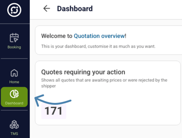
- Navigate to "Dashboard" in the menu.
|
 
|
Adding different Views
- You can select from default templates or create your own dashboards depending on what you want to see.
- You can add different views depending on what you want to see. For example, you can add "Operations Inbound" view and "Operations Outbound" view, with different charts that you can easily switch between.
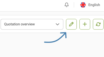
- In the top right corner, click the plus sign "+". This lets you create multiple views tailored to different aspects of your data.
- In the pop-up window, you can choose to use one of our predesigned templates or start from scratch to create your new view.
|
|
Start Customising
- To start customising this view, click on the pen.
- Add a new KPI Chart by clicking on "Add widget".
|

|
Dragging & Resizing
- Drag and drop the widget to arrange your layout.
- You can resize the graph by pulling the box by its corners.
|

|
Make Your Chart
- Click on a green gear icon ⚙ to customise your chart.
|
|
Select KPIs to visualise
- Name your graph and choose the KPIs that you want to turn into visual graphs.
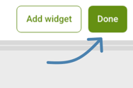
- Click Done in the top right corner once you are satisfied with this graph view..
|


